Election 2012: Twitter and Infographics
November 9, 2012
Yesterday I watched Twitter, especially observing tweets using the hashtag #election2012. A lot of people expressed their political beliefs via Twitter, making the social network an important place for debate and discussion.
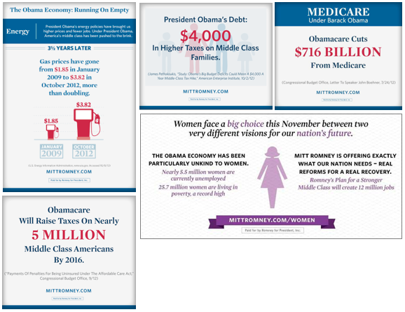
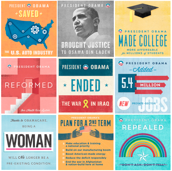
I was surprised to see such a difference between the Obama and Romney Twitter campaigns during the month of October through election day. Obama’s tweets were often written in the third person, tweeting about himself more than from himself, while Romney’s tweets were generally in first person, whether he or his staff were tweeting. Both approaches have their advantages and disadvantages. The biggest difference between their Twitter campaigns was evident to me in their infographics and images. Romney's infographics offered more valuable information on the issues for the benefit of voters. For example, one image stated, "Obamacare will raise taxes on nearly 5 million middle class Americans by 2016." Obama's infographics made bold statements that offered less information. For example, "President Obama reformed our health care system."

However, there were few images from Romney and they were poorly adapted to social media. On Twitter, images of all dimensions were posted - portrait, landscape, and almost-square. Moreover, Romney's infographics were text-heavy with inconsistent font choices. As one friend observed, "they look like PowerPoint slides."
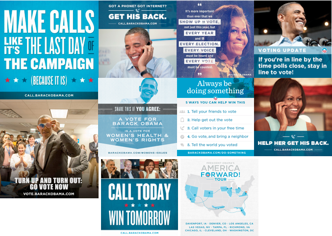
Obama’s infographics, on the other hand, were all square - optimized for Twitter, Facebook, Instagram, and Pinterest. Although Romney offered more information through his images, Obama expressed his most important points succinctly. The message on each was short, but very clear. The bold colors and design made the images more prone to be shared.

I noticed Romney shared his few infographics throughout October, then treated Twitter as a text-only platform from October 17 and on. Obama, on the other hand, shared many, many images throughout October and all the way through voting day.

